Quality Score Analysis via Google Data Studio
Quality score is the second-largest component in calculating the Ad Rank, a higher quality score can lead to lower prices and better ad position. Basically, it’s a key to a successful Google Ads campaign, you can determine any account’s health by the quality of its ads and keywords. In this post, you will learn how to run a quality score analysis using Google Data Studio, so you can identify the main areas where you’d like to focus your time, before you deep dive into analyzing each keyword performance individually.
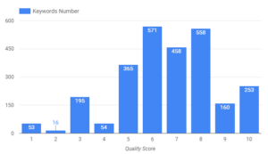
Quality Score vs Keywords Count
The first thing that we really want to know, is the account in good shape or not? does it really need a lot of quality score work? To answer this you should look at the quality score distribution for your keywords, how many keywords in each quality score area?
To count the number of your keywords, create a new calculated field and called it for example “Keywords Count”, you can use the function below:
COUNT(Search keyword)
Then create a bar chart and add the new metric we calculated “Keywords Number” along with the quality score dimension:
You probably think it’s a good idea to have the distribution percentage instead of the keyword raw number. However, Google Data Studio in the meantime doesn’t support the percentage of the parent total. So, if you came up with such formula:COUNT(Search keyword) / SUM(COUNT(Search keyword)) unfortunately, it won’t work.
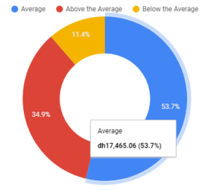
In this case, pie chart is your best bet, but having up to ten data series on a single pie chart would make your chart cluttered, messy, and hard to read. Thus, you should consider grouping your keywords’ quality scores into averages. For example, keywords with a quality score from 1-4 are considered “Below the Average”, from 5 to 7 are “Average”, and from 8 to 10 are “Above the Average”. To do this split, you need to create a custom dimension in your Google data studio source using CASE function as below:
CASE WHEN Keyword quality score < 5 THEN “Below the Average”
WHEN Keyword quality score > 7 THEN “Above the Average”
ELSE “Average”
END
Once you create the dimension, you can create a pie chart of the spend on each quality score area. As you can see, the majority of the spend is going toward keywords with “Average” quality score while only 11.4% of the spend on “Below the Average” keywords.
Quality Score vs Metrics
The number of keywords certainly is not enough to determine areas with issues. There are actual metrics that should be taken into consideration when running a quality score analysis. The metrics are impressions, clicks, cost, CPC, conversions, CPA and any KPI that matters to your business. Therefore, do include all of these metrics to your table so you have a full picture of the distribution.
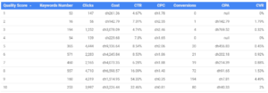
In most cases, you will find a strong correlation between your quality score, CTR, CPC, and CPA. The correlation can be represented clearly using a scatter chart plotting the CPC & CTR as below;
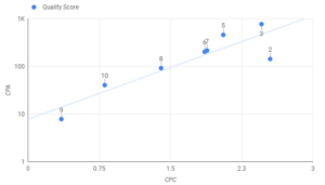
When looking at the trend line for the scatter chart above, there does appear to be a correlation between lower CPC, lower CPA, and higher quality score. Also, you can plot your main KPI alone vs the quality score grade. Looking at the bar chart below, you can see there is a sharper decrease in the CPA with increasing the quality score.
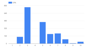
Based on your findings, you should review the 3 main factors of calculating the quality score
- CTR
- Ad Relevancy
- Landing Page
You should review the search terms associated with these keywords to help ensure relevancy, review ad copy for these ad groups, and also landing pages to help ensure barriers to conversion are removed. At the same time, you should take into account the spend driven by each keyword. For instance, if CPC and CPA are significantly higher for low QS terms but the percentage of total clicks was very low, then the impact of Quality Score improvement for such few terms on the account would be relatively small and therefore would likely not be worth the time spent to improve QS for those keywords.
Quality Score vs Branded Keywords
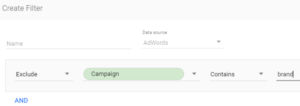
You should isolate the branded terms from your analysis since they will have the highest quality score which will skew your numbers and result in a misleading analysis. To filter our the branded keywords, you can use Google Data Studio has the Filters to weed out all the campaigns that contain “Brand” for example.
Conclusion
We haven’t really discussed how to improve the quality score, nevertheless, we covered how you can identify the main areas where you’d like to focus your time and take a deep dive. Therefore, you don’t waste effort on improving the quality score for terms with low impact and forget about terms need the most attention.

Entrepreneur focused on building MarTech products that bridge the gap between marketing and technology. Check out my latest products Markifact, Marketing Auditor & GA4 Auditor – discover all my products here.

Thanks a lot for that great report, but I tried to do it with Data Studio and when I try to calculate =Count (Search keywords) it doesn’t work. Can you help me ?
Thanks 🙂
Hello Oleg,
Can you please share a screenshot of the error you’re getting?
Hi Ahmed,
Great article and thanks for sharing.
I’m having issues with creating the custom dimensions which you mentioned in the article.
Under Create Field I have tried to past ‘Keyword quality score< 5 5 THEN "Below the Average"', but receive an error message 'Could not parse formula.'
Do you have an email address to send a screenshot as I can't seem to do this in the post.
Thanks in advance,
Esteban
Hi Estban,
You should use CASE function to do so, the formula below should work:
CASE WHEN Keyword quality score < 5 THEN "Below the Average" WHEN Keyword quality score > 7 THEN “Above the Average”
ELSE “Average”
END
Let me know how it goes, also feel free to reach me out through the “Contact Me” page 🙂
Thanks,
Ahmed
Hi Ahmed!
Trying to make a simple report with GDs and showing Campaign name vs historical quality score per data. Is it possible?
Thank you!
Hi Elvis,
I don’t think these metrics aren’t available to access through GDS yet 🙁
Thanks,
Ahmed
Hi Ahmed,
Very helpful post indeed. Thanks and ton for writing this. I am trying to setup an internal audit dashboard and this post has been a great help so far. I just ran into an small issue and wondering if you would like to extend some help. I am trying to show “all conversions” or “phone calls” alongside “conversions” againsts Quality Score dimension but the data studio says this can’t be shown together. Do you see a workaround? May be there is a way to count “Conversion” and “Phone calls” in a custom metric and show it here?
I need to show all conversions or phone call conversions because the majority of conversions on our campaign comes from phone calls.
Thanks in advance for your time on this.
I found an easy (well, after I figured it out) fix for the problem of Quality Score analysis in Data Studio. I’m using the Supermetrics AdWords connector, combined with a case statement that redefines the field as a number (you can’t simply use CAST to make this work).
Field name: Supermetrics Quality Score as Number
Code:
CASE
WHEN Quality score = “1” THEN 1
WHEN Quality score = “2” THEN 2
WHEN Quality score = “3” THEN 3
WHEN Quality score = “4” THEN 4
WHEN Quality score = “5” THEN 5
WHEN Quality score = “6” THEN 6
WHEN Quality score = “7” THEN 7
WHEN Quality score = “8” THEN 8
WHEN Quality score = “9” THEN 9
WHEN Quality score = “10” THEN 10
ELSE 0
END
This will give you a dimension you can sort properly (the supermetrics field is a text value and sorting it puts 10 right between 1 and 2). You can then add cost, CTR, impressions and whatever other metrics you want to create a pretty table that analyzes these KPIs by Quality Score.
Hope this is helpful – I searched all over the web and this post was the closest I could find to addressing my needs.
Ahmed – thank you for posting – I could not have thought of my solution without getting a start from you!! You rock!!
Oh, also the Supermetrics connector has the historical quality score fields. You can make them into numbers using the same technique I believe.
Drawing trend lines is one of the few easy techniques that really WORK. Prices respect a trend line, or break through it resulting in a massive move. Drawing good trend lines is the MOST REWARDING skill.
The problem is, as you may have already experienced, too many false breakouts. You see trend lines everywhere, however not all trend lines should be considered. You have to distinguish between STRONG and WEAK trend lines.
One good guideline is that a strong trend line should have AT LEAST THREE touching points. Trend lines with more than four touching points are MONSTER trend lines and you should be always prepared for the massive breakout!
This sophisticated software automatically draws only the strongest trend lines and recognizes the most reliable chart patterns formed by trend lines…
http://www.forextrendy.com?kdhfhs93874
Chart patterns such as “Triangles, Flags and Wedges” are price formations that will provide you with consistent profits.
Before the age of computing power, the professionals used to analyze every single chart to search for chart patterns. This kind of analysis was very time consuming, but it was worth it. Now it’s time to use powerful dedicated computers that will do the job for you:
http://www.forextrendy.com?kdhfhs93874