
Select The Best Chart For Your Report
Selecting the best chart or graph is very important to tell your story and communicate the information you want. In this article, we will learn how to choose the best chart for your performance report and data analysis based on our objective.
To create a chart, you need first to understand why you might need this chart, below is the 5 most common reasons that we use to present our data:-
1- Comparison
2- Composition
3- Distribution
4- Trend over time
5- Relationship
To determine which chart is best suited for your report, let’s have a look at each reason or type separately:-
Comparison
If you want to compare two or more variables, charts can easily show the low and high values in the data sets.
Examples:-
# To compare the performance of your search engine marketing campaigns versus paid social campaigns.
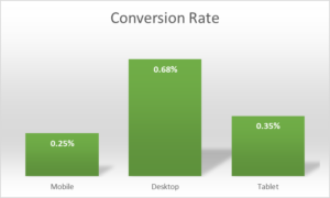
# To compare the performance of mobile website versus desktop website.
For comparing two or more variables the best charts are :
1- Column charts
2- Bar charts
3- Line charts
4- Combination charts
Composition
To show how individual parts make up the whole of something or how various parts comprise the whole.
Examples:-
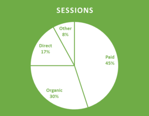
# To show a breakdown of website traffic sources from Analytics.
# To show browser types of website visitors.
Charts can be used to show composition:-
1- Pie charts
2- Stacked Column charts
3- Stacked bar charts
4- Area
Distribution
You want to show the distribution of a set of value to understand outliers or normal ranges.
Examples:-
# Distribution of website pages loading time.
# Distribution of repeat visits to your website.
Charts that can be used to show a distribution:-
1- Scatter plots
2- Line charts
3- Histogram
Trend over time
If you are interested in analyzing trends in your data set and want to know more about how data perform during specific time period.
Examples:-
# To show the conversion rate trend month on month.
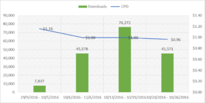
# To show the average order value in the past year from your AdWords campaigns.
Charts that can be used to analyze trends:-
1- Line charts
2- Column charts
Relationship
You want to show or establish a relationship between two variables.
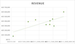
Examples:-
# Relationship between website traffic and revenue.
# Relationship between keywords length and CTR.
Charts that can be used to show a relationship between two variables:-
1- Scatter plots
2- Line charts
Summary
The first and most important thing when it comes to chart selection is “what’s the purpose of this chart?” Is it to show a trend over time or a data composition? Once you have the answer, you can easily select the right chart to tell your story and communicate all the information you need.

Entrepreneur focused on building MarTech products that bridge the gap between marketing and technology. Check out my latest product GA4 Auditor and discover all my products here.