
Cohort Analysis for Performance Marketing
A cohort is a group of users who share a common characteristic, while cohort analysis is a study that focuses on the activities of a particular cohort. It allows you to compare how different cohort of customers behave over time and see the pattern of the lifetime value of a customer or a user.
Examples of using cohort analysis:-
1- Understand customers’ retention.
2- Calculate customers lifetime value and this is the most common use of cohort analysis (that will demonstrate here today).
3- Compare cohorts of users from different segments.
How to perform a cohort analysis?
You have to determine first what question you want to answer, in this article will cover how to conduct a lifetime value cohort analysis. There are two ways to conduct a cohort analysis, the first way through a tool; there are many analytics tools that help to analyze users based on a segment of data, but here will be covering just Google analytics cohort report. The second way is you perform the analysis on your own, you collect the data and try to visualize it in excel. So, let’s start first with the one you can do with your hands:-
Perform Your Own CLV Cohort Analysis
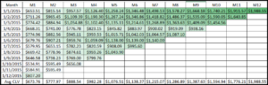
In order to perform a lifetime value analysis, you need to have a raw data where your customers would normally be grouped into acquisition month and then studied over their time with your business. This might save you a lot of time if you going to conduct this analysis on a regular basis. To start off, my recommendation that you have the data formatted as below:-
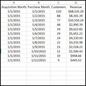
Acquisition month:- it’s the cohort date or the first month when a user transacted. For example, if a customer made their first purchase in January 2015 (acquisition month) and then purchased again in March 2015 (purchase month) their first purchase would be in month 1 life cycle stage and their second purchase will be month 3 life cycle stage, because it happened in their third month after becoming a customer. To calculate life cycle stage, we’ll need to determine the amount of time between the customer’s first purchase and the purchase in question. Then, you can create a pivot table which will create a revenue array, but just for the sake of explaining this in much easier way, we are going to do a simple calculation on the dummy data below.
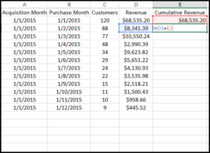
To calculate the cumulative revenue for customers acquired in Jan 2015, you add up the revenue generated in previous months to the current month as seen below:-
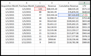
And to calculate the average value for customers in each month, you divided the cumulative revenue by the total number of acquired users in the cohort month.
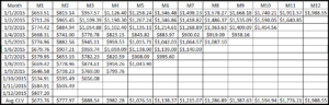
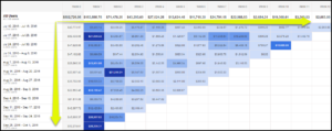
Again, you can create a pivot table which will create a revenue array. Pivot tables allow you to calculate an aggregation such as a sum or average across multiple dimensions of your data. The pivot table we’d like to create here is one that conducts a SUM of the transaction amount, shows one row per cohort and one column per relative time period. Once you have your array, you can begin to accumulate revenue for every cohort you have. You can transpose it in the format below, which is one of the most common visualization methods of cohort analysis.
You can also apply conditional formatting on your numbers to make it look better, moreover, you can use many visualization tools that make it so easy to browse cohort data sets, just Google “cohort analysis visualization tools”.
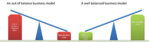
Now, once you know your customer lifetime value (CLV), you need to compare it to your customer acquisition cost (CAC), so you need to know how much you spent to acquire these new customers. If your CAC < CLV or the ratio > 1, it means you are fine, but if the ratio is so close to 1, it means you hardly break even on the cost of sales.
Google Analytics Cohort Analysis Report
Google Analytics now has a real cohort analysis report that allows you to understand how customers behave over time. To open the cohort analysis report, select “Audience” then “Cohort Analysis”
Let’s look at the various parts of the report:-
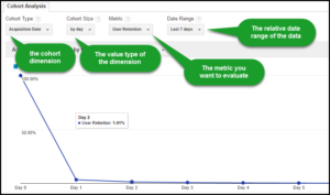
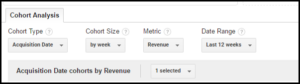
So, let’s say you want to perform a lifetime value analysis to know how much revenue customers generate over time. In this case, you need to select your cohort metric as “Revenue” and the date range for your cohort data.
The main drawback here is the maximum lookback window for google analytics is just 3 month, this means you can’t if you want to conduct a lifetime value with month or a year dimension, it won’t work or it won’t be efficient at all.
By default, Google Analytics can not track users across devices/browsers as client ID can exist only on the device/browser where it has been set. In a user ID view, you can get better users count.Consequently, your cohort analysis is going to be more accurate when done via the user id view.
Conclusion
You may have noticed that performing a cohort analysis on your own is time-consuming or not efficient if you are relying on Google Analytics. As a result, I would recommend if you want to do more and better cohort analysis to use advanced analytics/reporting tools like Kissmetrics or RJ metrics.

Entrepreneur focused on building MarTech products that bridge the gap between marketing and technology. Check out my latest product GA4 Auditor and discover all my products here.
I see your blog is similar to my blog. Do you allow guest posts?
I can write hi quality posts for you. Let me know if you
are interested.